Fresh Harvest
Sustainably sourced food from farmer's fields to your doorstep
Project Type: User Journey & Web Design
Agency: Acadia
Art Direction & User Journey: Neil Shastri
Designer: Sebastian Larsen
Tools: Balsamiq & Adobe Xd
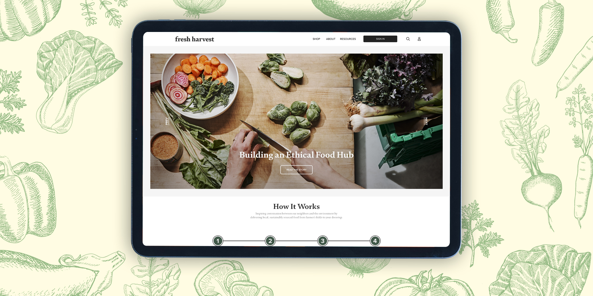
Fresh Harvest is an Atlanta-based, ethically sourced, food subscription service. Working with local farms, Fresh Harvest leads the local food movement by providing its subscribers with organic produce and groceries. After a decade of successfully establishing a growing business, the Fresh Harvest team came to Acadia with the goal to reach new artisan farmer networks and expand its customer base. With that, our web design team had the task to improve upon their existing website user journey and redesign a site that would help Fresh Harvest grow and scale its business.
The Fresh Harvest team has spent a decade refining its operational services, demanding a wide variety of interactions with its recurring and new customers. These interactions are run through the Fresh Harvest website and must be seamless and easy to navigate. Without a functional and manageable website, operations would be negatively impacted, preventing Fresh Harvest from continuing on its path of leading the local & sustainable food movement.
With this in mind, our website redesign mission could not be accomplished without first discussing the pain points of the previous website with the Fresh Harvest team. Along with this discussion, our team at Acadia analyzed the site to find areas of improvement.
Once we learned about these pain points, goals to improve, and the data our team gathered for recommendations, we began the process of crafting a custom user journey.
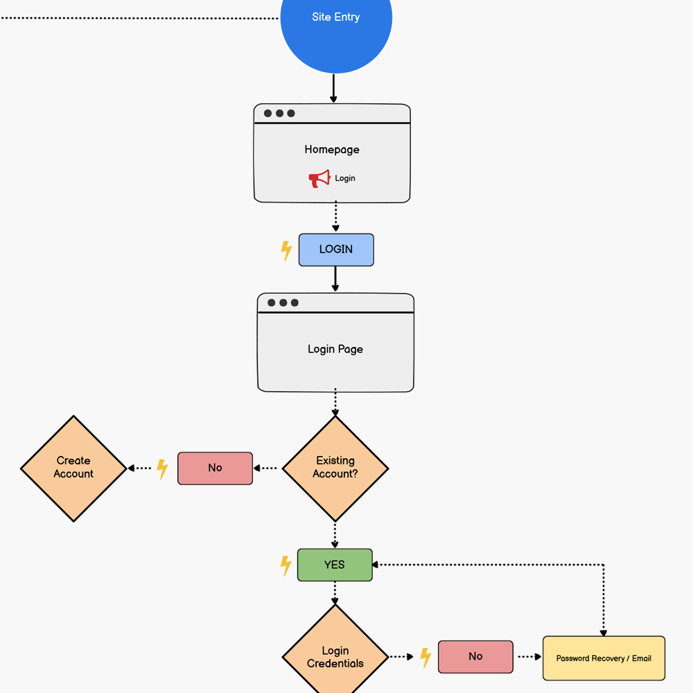
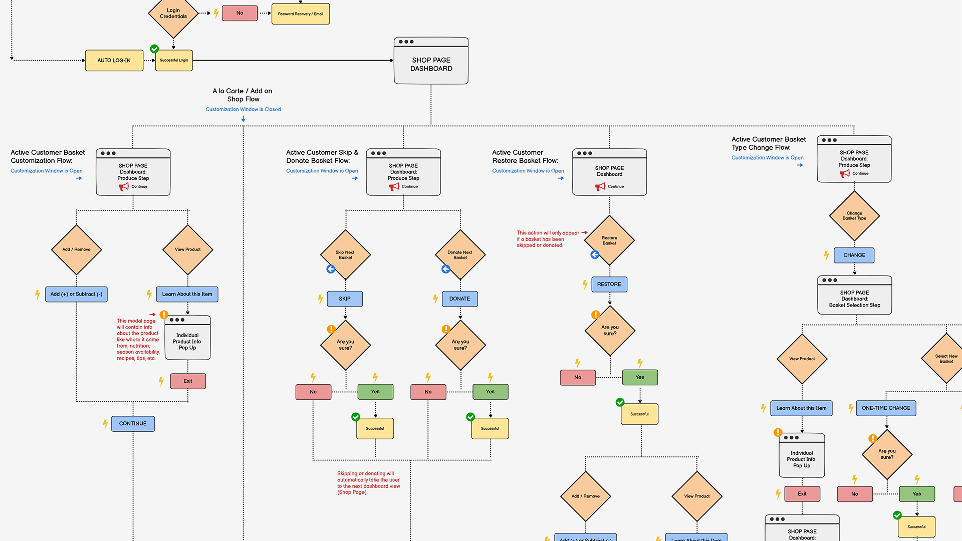
When crafting the user journey, our team at Acadia worked closely with Fresh Harvest to iteratively fine-tune pathways for its customers. This required carefully mapping out specific prompts such as the weekly reordering process for recurring customers, the onboarding process for new customers, notifying Fresh Harvest when deliveries need to be skipped, and even how to cancel your subscription. Our team utilized the wire mapping software to lay out and plan the user journey. The work done at this stage of the process was crucial in helping our web design team understand how every single component would need to function on the website.
After solidifying the road maps for our multiple pathways of the user journey, our team worked in Balsamiq to lay out low-fidelity wireframes to help our design team to better understand the functions of the website and begin the design phase.
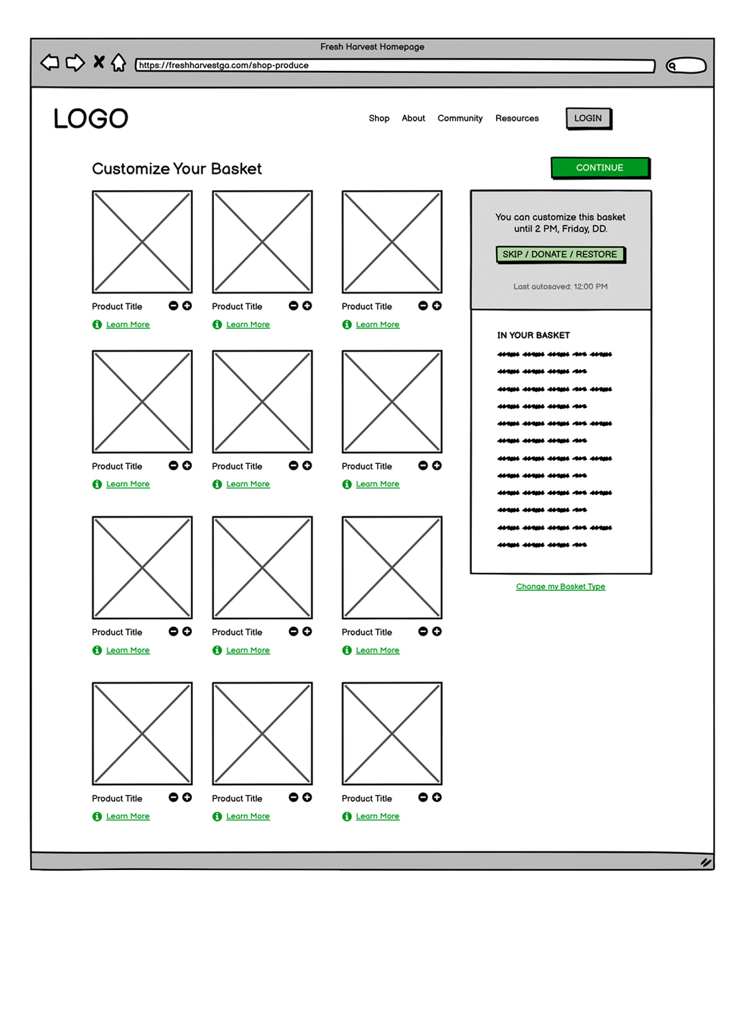
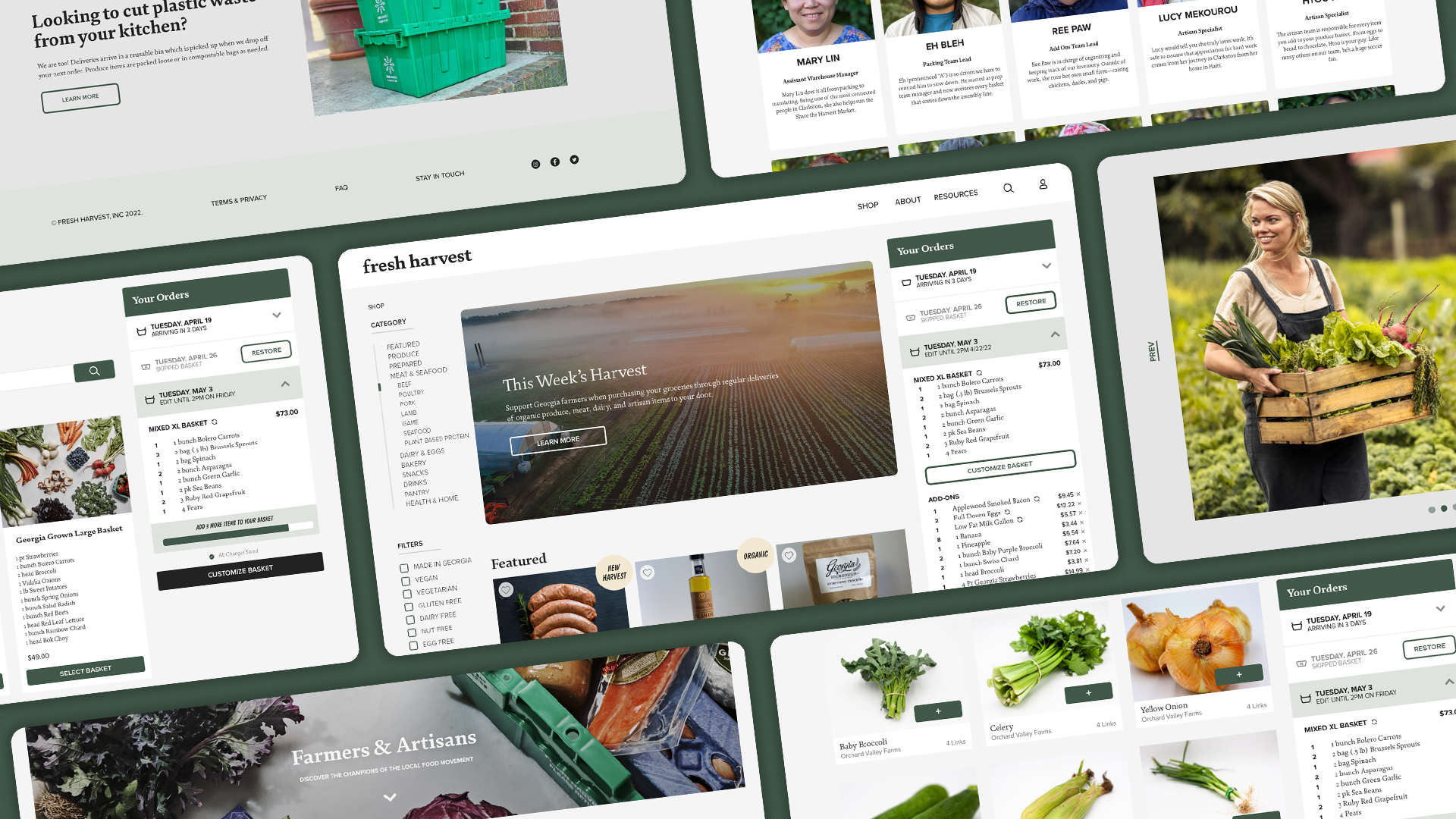
The low-fidelity wireframes provided a visual frame or reference for the primary functions of each individual web page and helped our team to smoothly transition into high-fidelity web comps. At the time, Fresh Harvest had just finished working with a branding agency to update its brand identity - which included new logo designs, color palettes, and fonts. With this information already complete, our web design team at Acadia was able to focus its attention directly on developing elevated and elegant web design solutions in Adobe Xd.
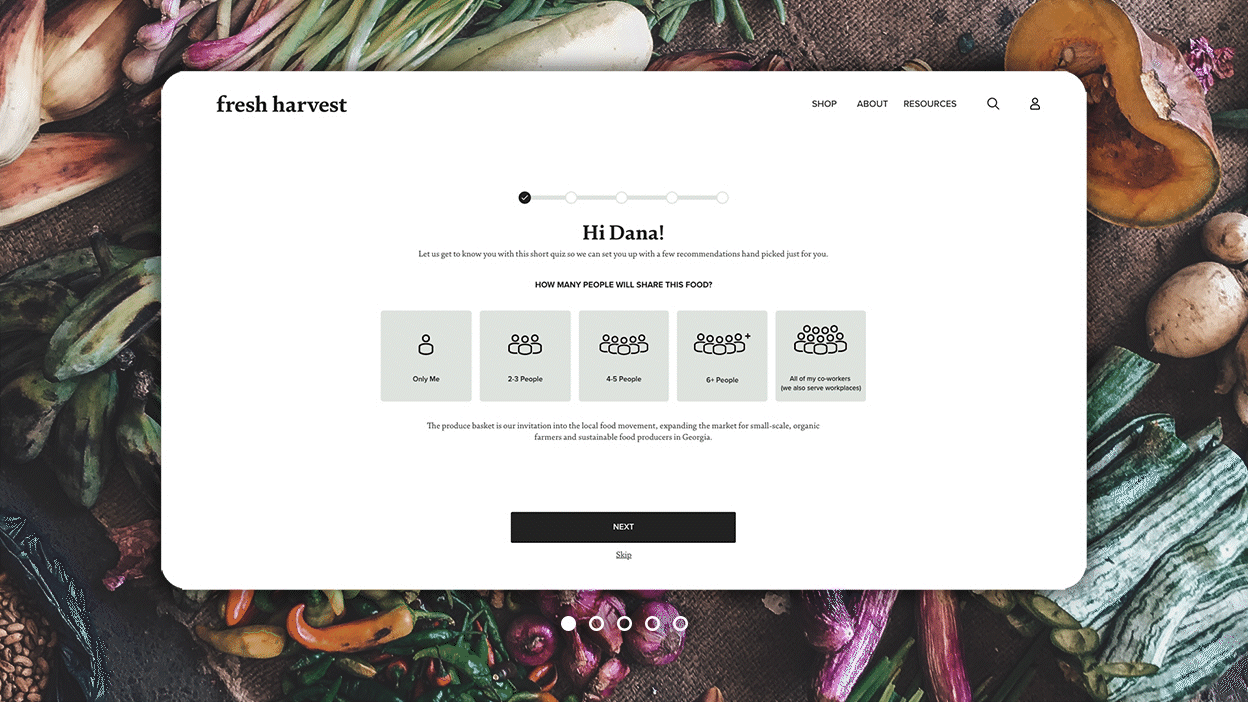
One of the most important features of the Fresh Harvest business model is the onboarding of new customers. Factors like dietary preferences, budget, members of the household, etc. need to be assessed in order to create the best experience for Fresh Harvest users. As shown below, our design team was able to successfully introduce a new onboarding questionnaire that effortlessly guides new Fresh Harvest customers through this crucial first step.
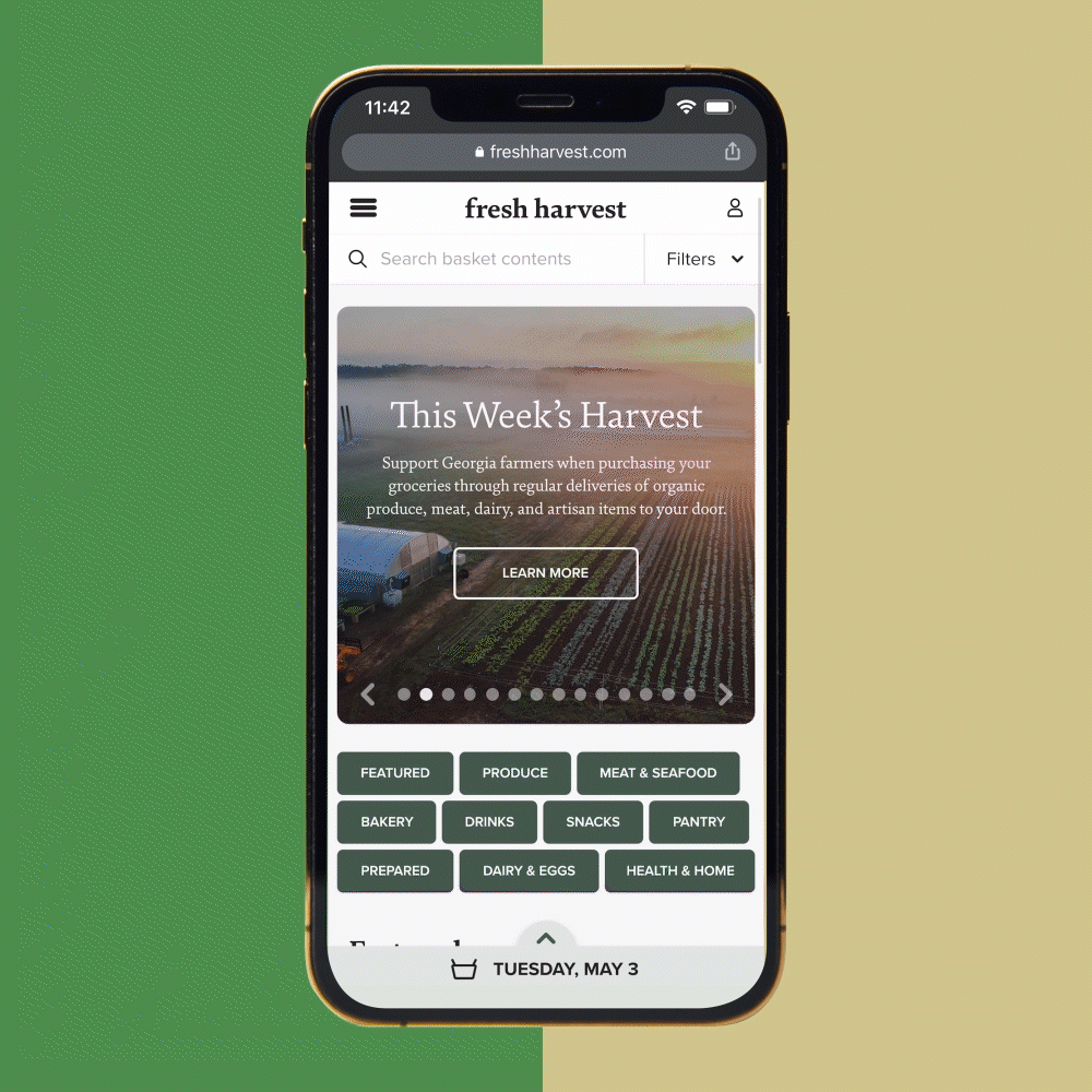
Prior to Fresh Harvest partnering with Acadia, their previous website was not able to provide users with a functional mobile experience. Mostly everyone uses their smartphones for convenience and having an easy-to-use mobile site design was a necessity for delivering a successful final product.
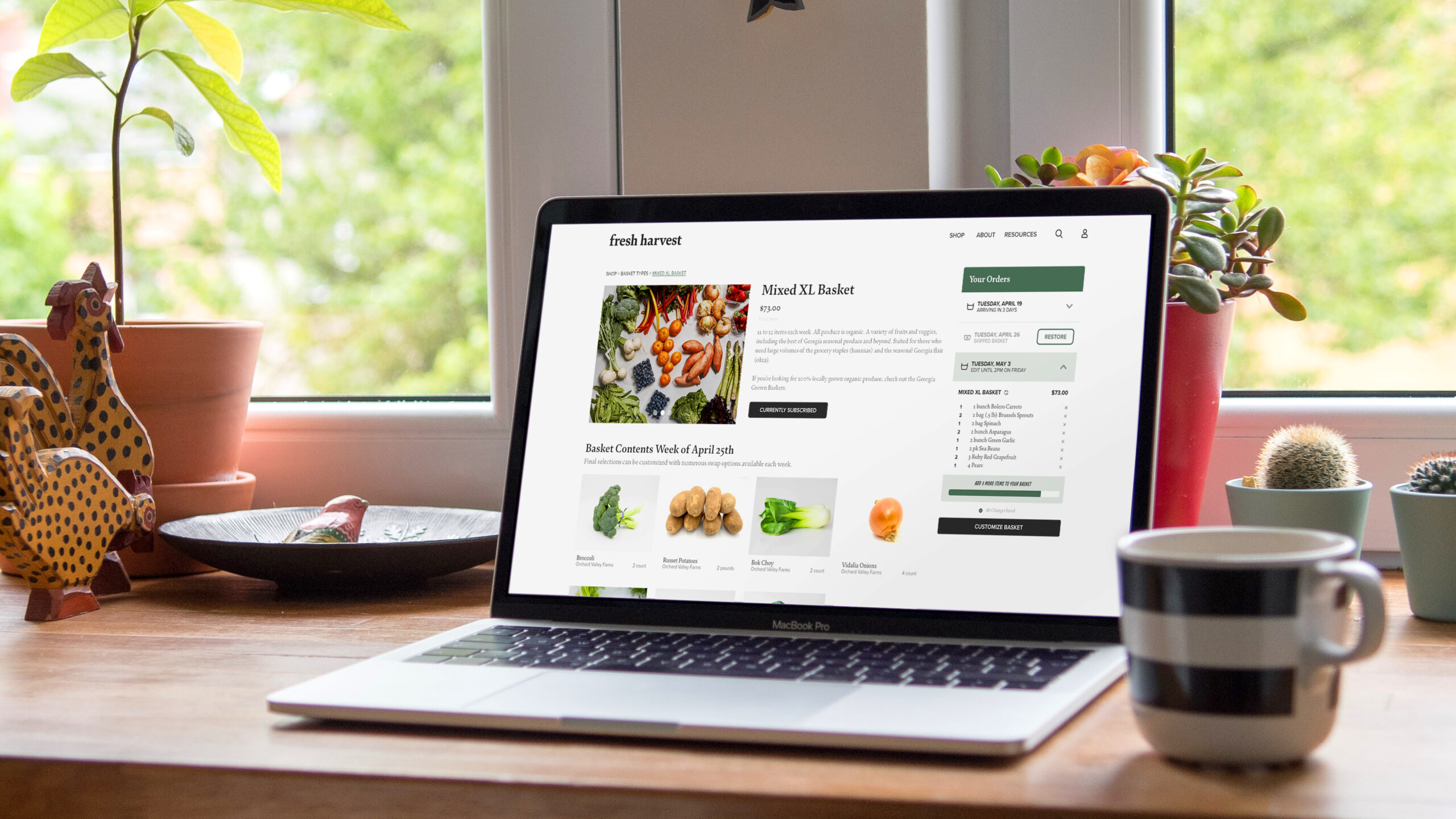
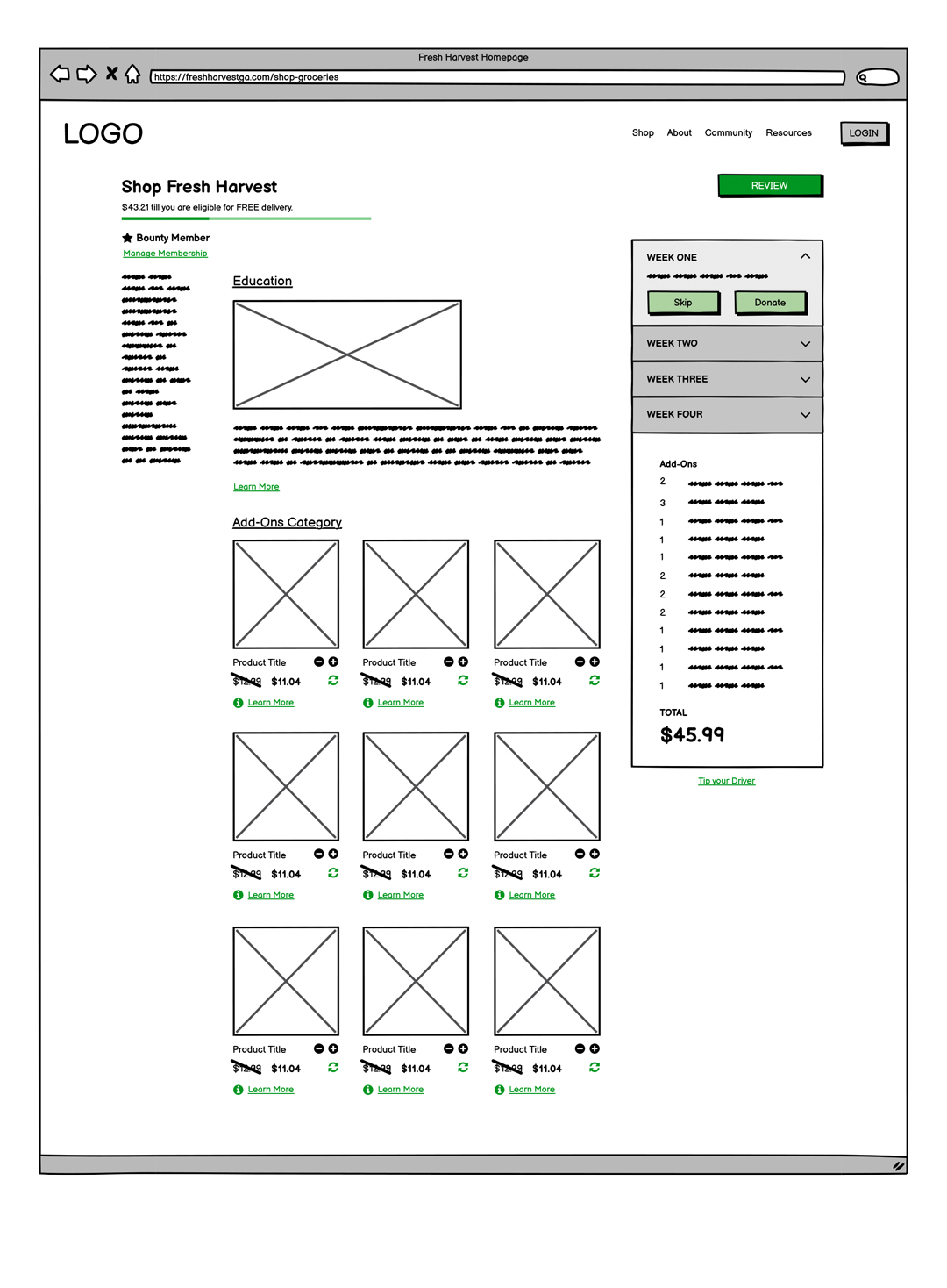
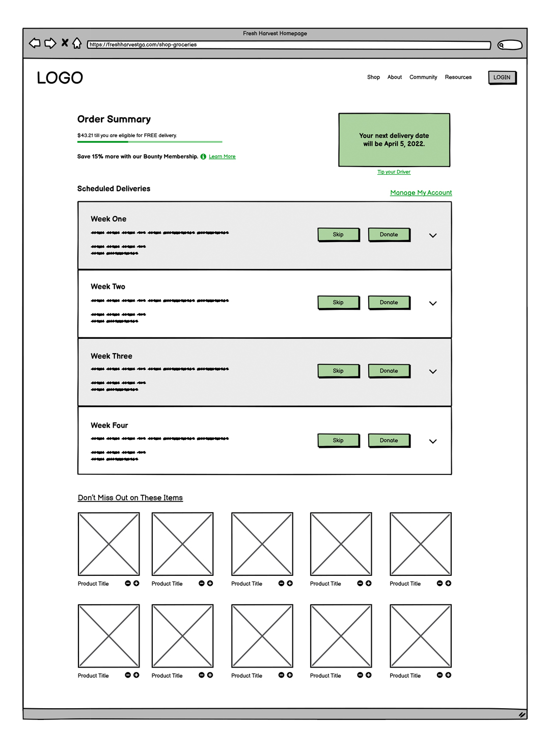
One of the key areas our team needed to focus on was the main shopping page, which allows Fresh Harvest subscribers to add produce and other groceries to their weekly baskets. This page needed to consolidate all features from the desktop page into a mobile layout without compromising functionality.
A solution for maximizing space on the mobile shop page was to design a collapsible "customize basket" window that expands upward from the bottom of the screen and allows users to make changes to aspects like their product selections and to view the cost breakdown of their items. Also featued on the page is a bold and intuitive quantity selector which allows shoppers to quickly add or subtract items the same way they might in a physical grocery store.
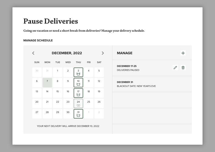
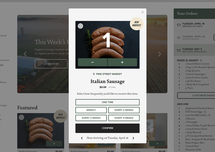
During the mapping and planning of the user journey, our team learned that the use of pop-up and modal windows would need to be implemented to prevent users from leaving too many site pages, ultimately allowing us to create an easy-to-use user experience. As shown in the "Pause Deliveries" calendar and "Product Frequency" windows above, our team designed sophisticated pop-up components that give Fresh Harvest users that extra layer of control, allowing them to get the most of its service in a way that is also mindful of their time.
Contact
Atlanta | St. Louis | Minneapolis
neil@neilshastri.design
"Storytelling is the most powerful way to put ideas into the world today."
-Robert McKee
© Neil Shastri 2024
Art Director / Senior Designer / Creative Producer