Urban Pops
Modernizing the digital presence of a New York tradition
Project Type: Brand Identity & Web Design
Agency: Acadia
Designer: Neil Shastri
Tools: Adobe Illustrator, Adobe Xd, and Shopify
Urban Pops is an NYC-based store that brings people together with delicious 100% Kosher and Dairy-free handcrafted pops. The first flagship store opened in Brooklyn and now has expanded to three additional stores in the New York area, allowing them to make deliveries to a wider radius of zip codes. With Urban Pops' rapidly growing business, they came to Acadia in 2022 with the goal to redesign their brand identity and modernize their customers' online shopping experience.
Urban Pops' former brand identity was already vibrant, youthful, exciting, and playful. Moreover, their customer base has been familiar with the product for many years and with that, has developed a loyalty to the brand. Being mindful of this was paramount in how our team at Acadia approached this rebrand. Our task was to take what Urban Pops founder, Sophia Cohen, and her team have built over the years and construct a visual identity that continued that evolution.
Our goal for this project was to take what New Yorkers have already come to love and redesign the brand identity in a unique way that celebrates the Urban Pops brand and its delicious products.
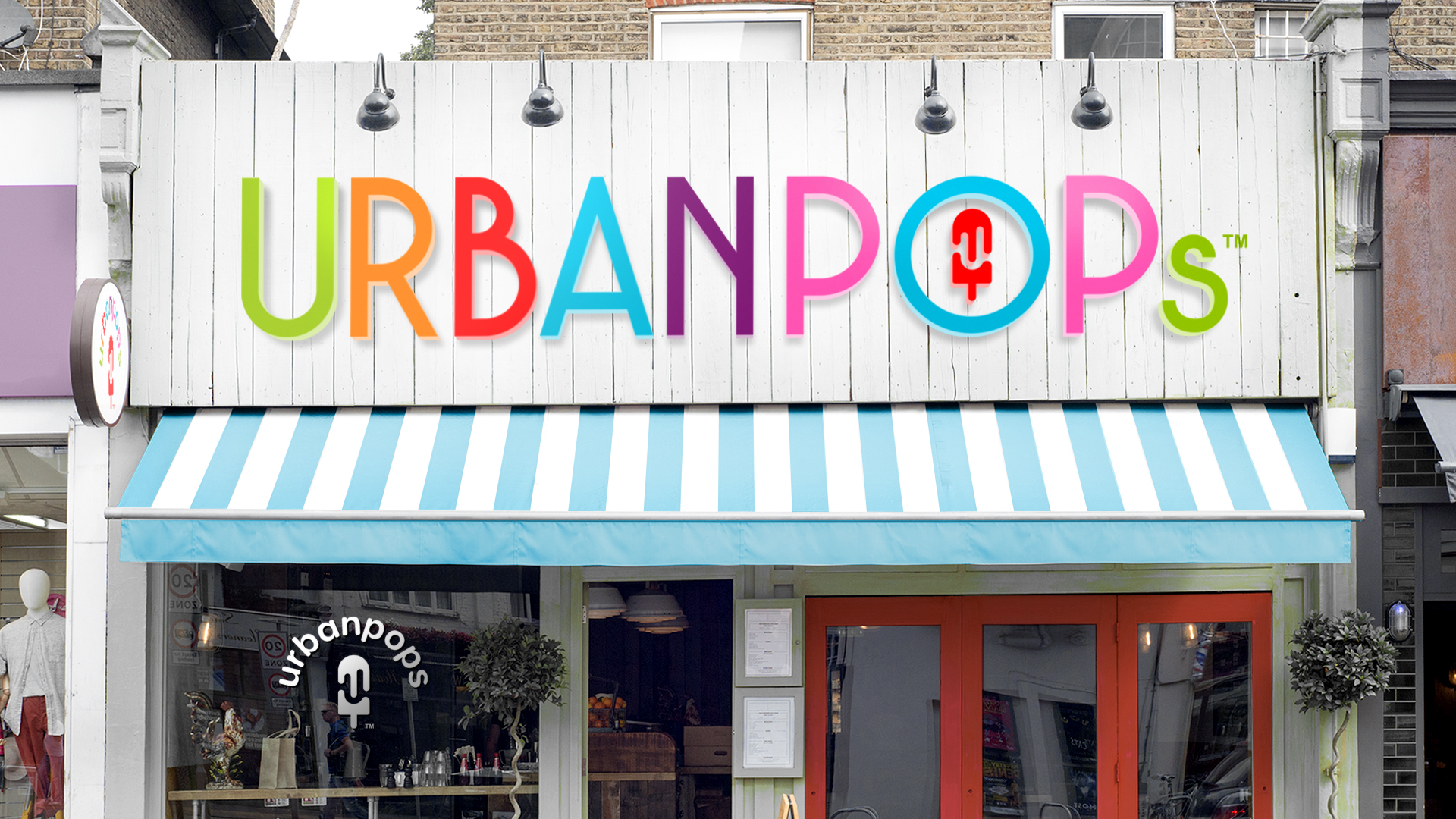
The original Urban Pops logo was hand-drawn to pay tribute to its delicious handcrafted popsicles. Our task was to take that logo and modernize it for both digital platforms and physical brand materials and store signage.
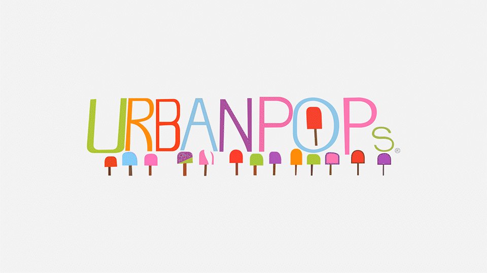
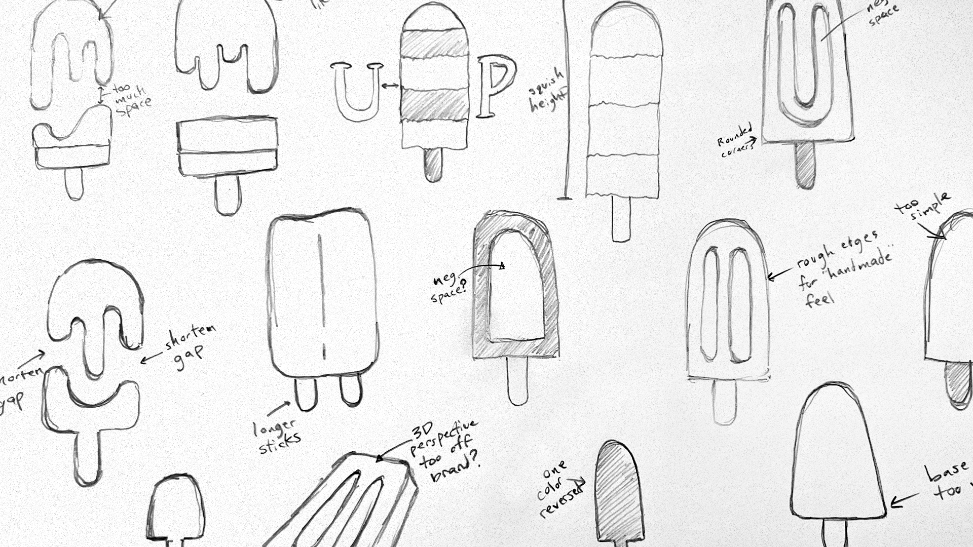
What we loved about the Urban Pops logo was the vibrant rainbow of brand colors and the variety of featured popsicles. With this task at hand, our team took to the drawing board to explore how we could introduce a new iconic element to the already eye-catching Urban Pops visual identity.
Featured: Urban Pops brand seal and Brandmark
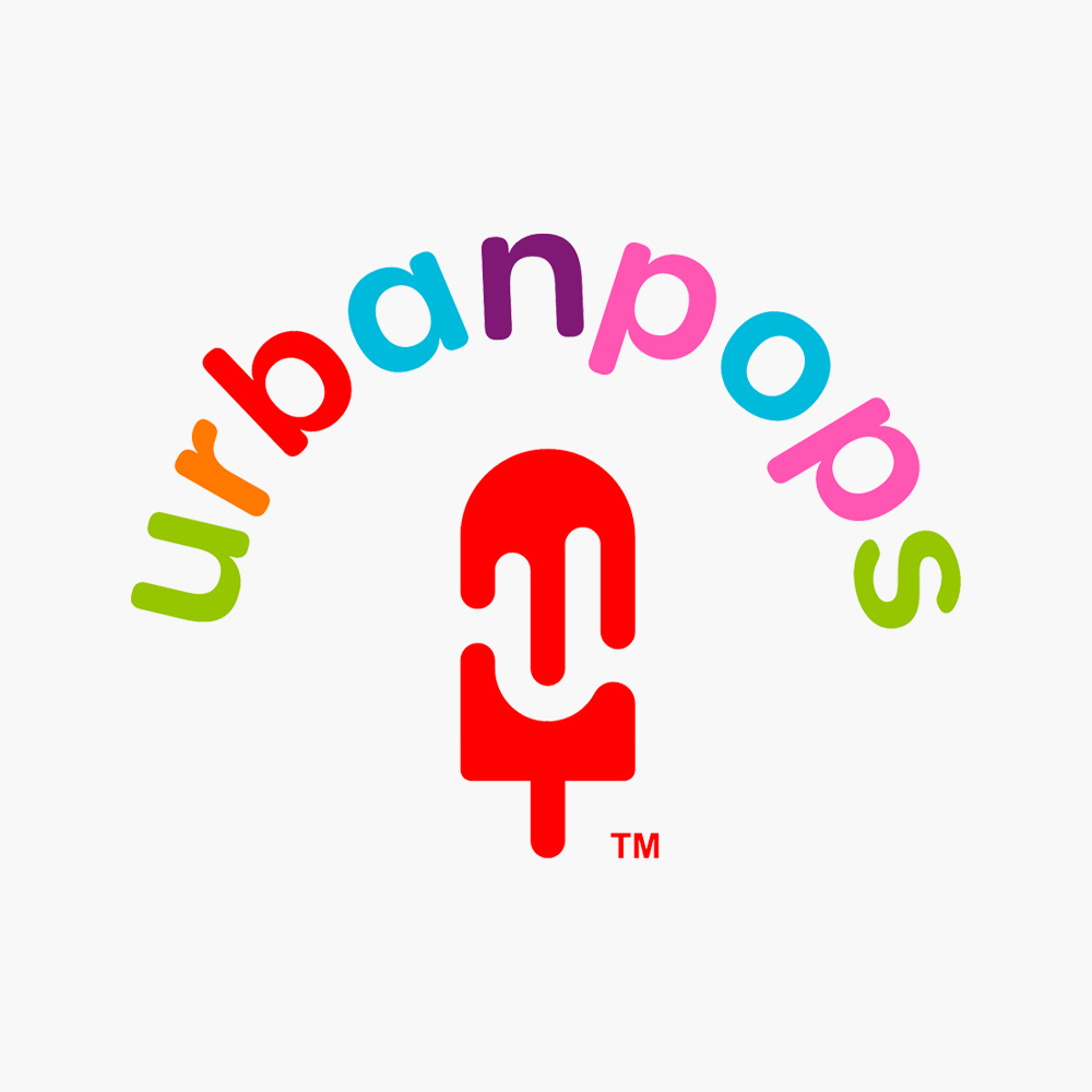

After many sketches and exploring concepts, our team at Acadia and Urban Pops fell in love with the clever new brandmark shown above. This icon, inspired by the previous Urban Pops logo's red popsicle featured in the "O", has dual characteristics. The first is quite obviously the shape that alludes to the pops that the store sells. However, stemming from the negative space within the popsicle that forms the universally recognized popsicle mold indents, we have designed the brandmark to feature the initial "U", acting as the new face of the Urban Pops brand.
With this new brandmark, we gave the Urban Pops logotype a facelift and placed the new logo into the "O," just like the brand's former logo. However, this new icon can stand alone successfuly by itself, on varying color backdrops, without needing to rely on the full Urban Pops logotype.
For smaller scale and 1:1 square ratio instances where the Urban Pops team would need the logo to include their name, we designed a brand seal that acts as a secondary logo, providing a layer of brand versatility.
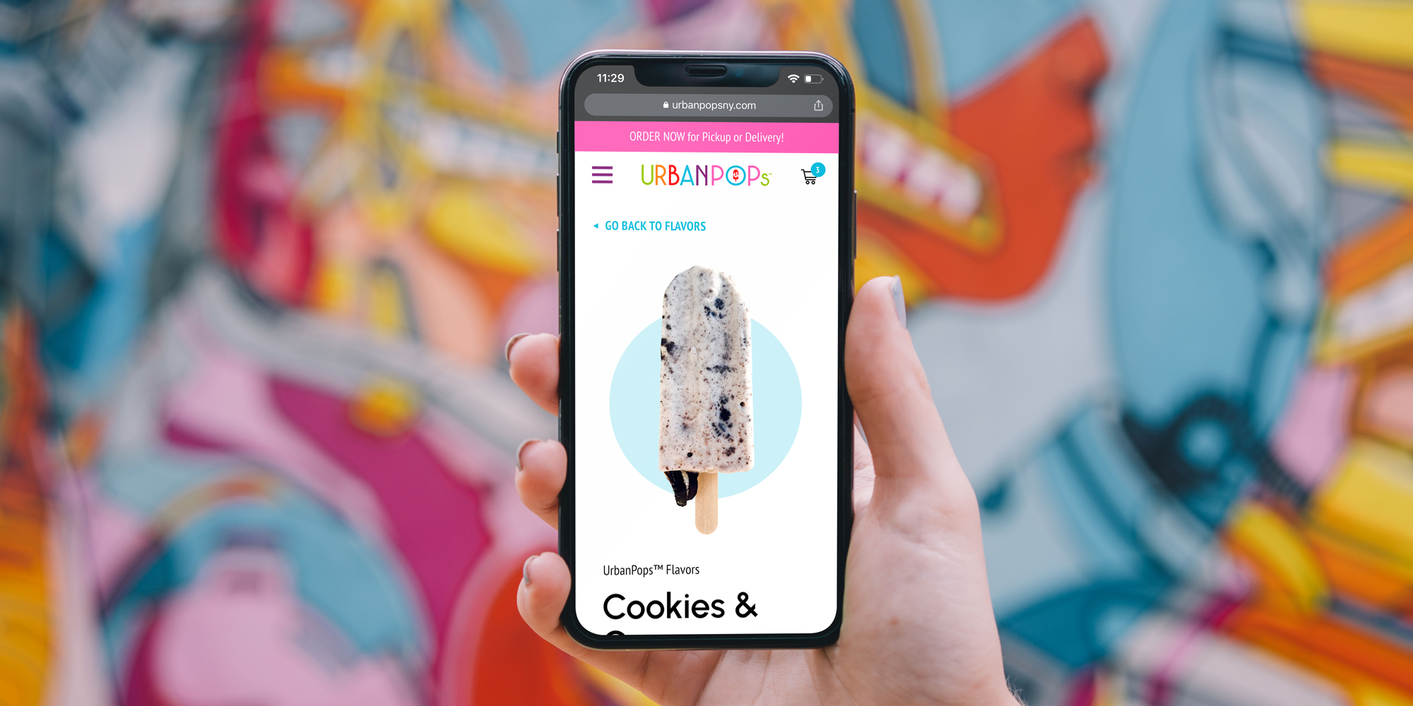
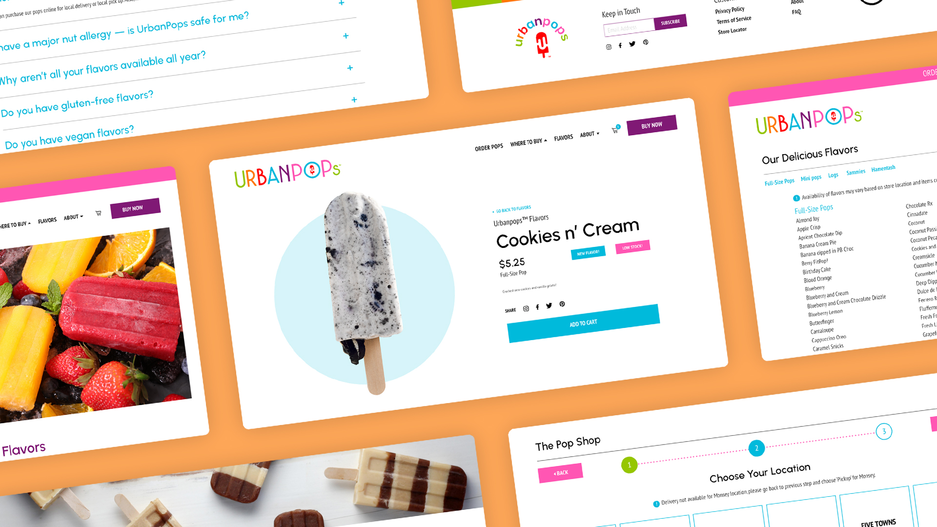
With the approval of the new Urban Pops brand identity, equipped with new logos, fonts, and color palettes, our web design team at Acadia tackled the next task of designing a new, robust website design. The key focus for the Urban Pops website was to develop a user journey that allows customers to quickly navigate Urban Pops' long list of flavors and effortlessly order their pops online.
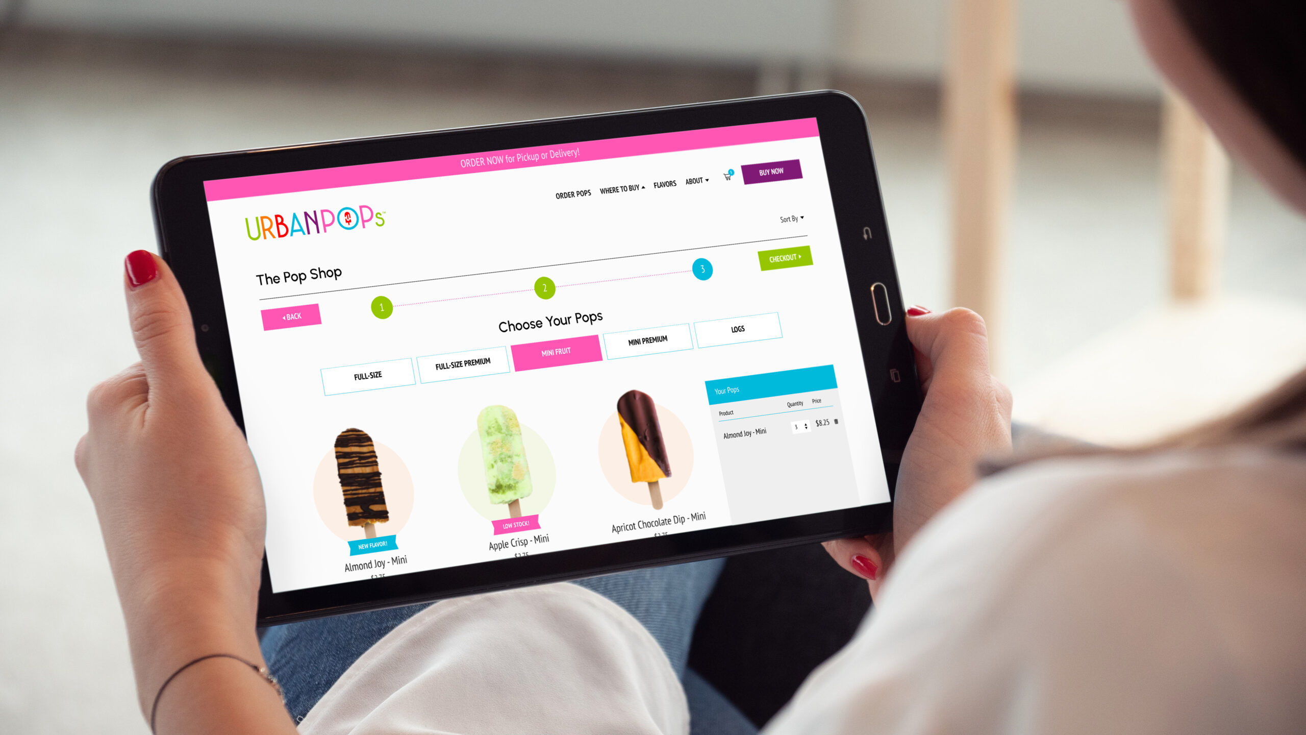
The challenge was to develop a system that would intelligently provide Urban Pops' customers with popsicles that are available for pickup or delivery, dependent upon the location of the store, and the proximity of the customer to that store. Our team at Acadia came up with the solution to develop a guided step-by-step ordering process that requires the user to input key location-based information prior to ordering their pops.
This new guided customer ordering process ensures that Urban Pops will deliver the correct popsicle flavors based on what pops are stocked in the stores closest to their customers. With this new and improved system, customers get a more convenient shopping experience that will help pave the way for Urban Pops to scale their business more rapidly.
Contact
Atlanta | St. Louis | Minneapolis
neil@neilshastri.design
"Storytelling is the most powerful way to put ideas into the world today."
-Robert McKee
© Neil Shastri 2024
Art Director / Senior Designer / Creative Producer